


Table of contents
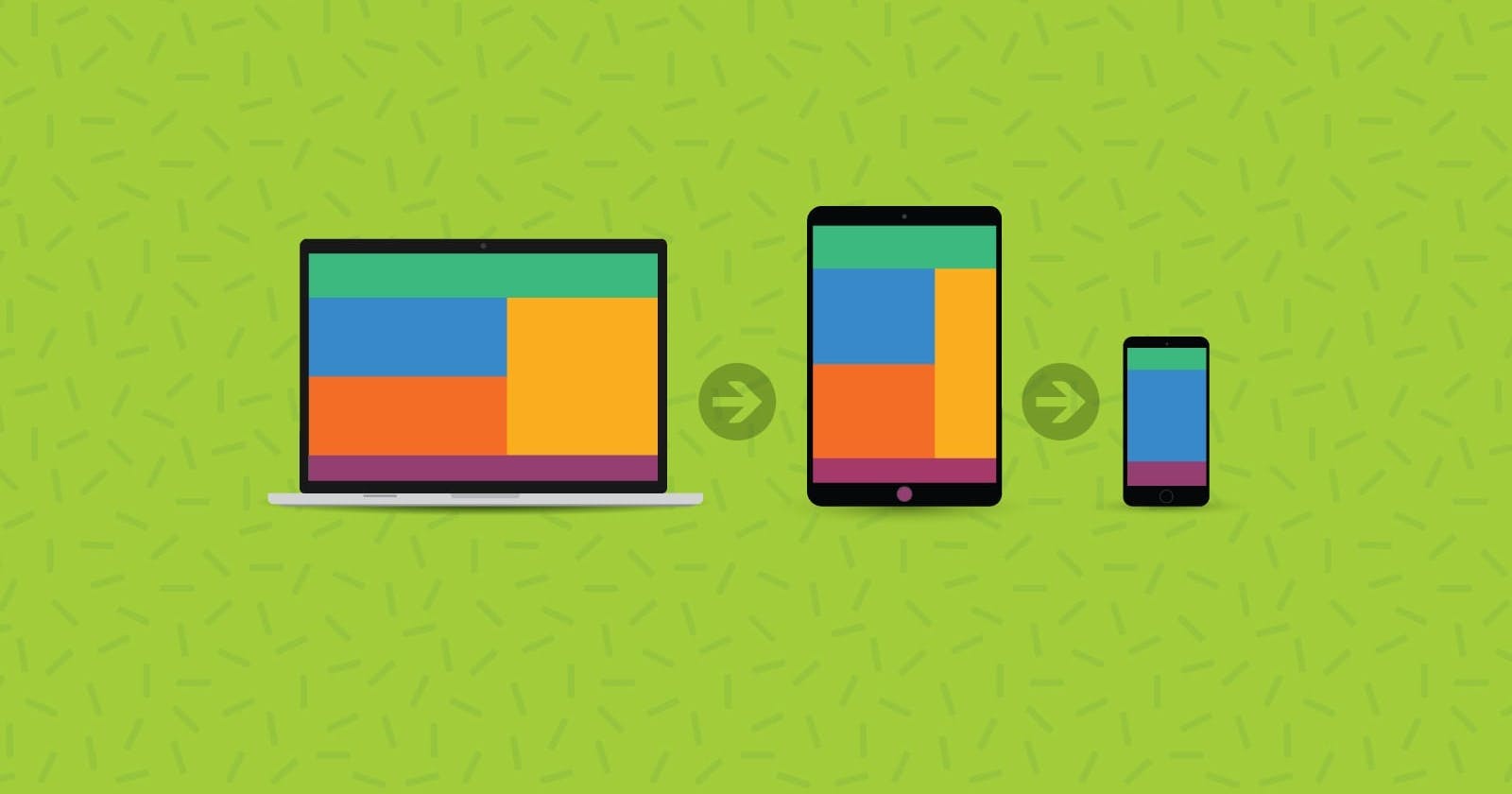
In the rapidly evolving field of web development, ensuring that your website shines on all devices and screen sizes has become a top priority. The days of designing exclusively for desktop computers are long gone; today, users navigate the web using a plethora of devices, including smartphones, tablets, laptops, and desktops. This paradigm shift in user behavior has elevated responsive web design to a critical aspect of modern web development, and at its core lies the indispensable.tool known as media queries.
Understanding Media Queries
Media queries serve as a cornerstone of responsive web design, empowering developers to apply specific CSS rules based on various attributes of the user's device. These attributes may include screen width, height, orientation, resolution, and more. Such granular control enables websites to seamlessly adapt to diverse devices, delivering an optimal viewing experience for users regardless of their chosen platform.
Syntax and Usage
The syntax of a media query typically adheres to this structure:
cssCopy code@media media-type and (media-feature) {
  /* CSS rules to be applied */
}
Media Type: Denotes the type of media targeted by the query, such as screen, print, speech, etc. For web development, the screen type is most commonly used.
Media Feature: Specifies the conditions under which the styles should apply. This encompasses properties like width, height, orientation, min-width, max-width, and more.
Responsive Media Query Types
Let's delve into specific examples of responsive media queries tailored for various device sizes:
cssCopy code@media (min-width: 320px) { /* Smartphones, portrait iPhone, portrait 480x320 phones (Android) */ }
@media (min-width: 480px) { /* Smartphones, Android phones, landscape iPhone */ }
@media (min-width: 600px) { /* Portrait tablets, portrait iPad, e-readers (Nook/Kindle), landscape 800x480 phones (Android) */ }
@media (min-width: 801px) { /* Tablet, landscape iPad, lo-res laptops, and desktops */ }
@media (min-width: 1025px) { /* Big landscape tablets, laptops, and desktops */ }
@media (min-width: 1281px) { /* Hi-res laptops and desktops */ }
By utilizing these media queries effectively within your CSS codebase, you can craft a responsive web design that seamlessly adjusts its layout, typography, and visual elements to suit the unique characteristics of each user's device. This adaptability not only enhances user experience but also future-proofs your website in an ever-evolving digital landscape.
Conclusion
In conclusion, mastering media queries is essential for ensuring that your website remains accessible, engaging, and visually appealing across the vast array of devices that users utilize to access the web. Embrace responsive design principles and harness the power of media queries to deliver exceptional user experiences on every screen.
If you found this blog post helpful, please consider sharing it with others who might benefit. You can also follow me for more content on web Development topics.
For Paid collaboration mail me at: gokilp25@mail.com
Connect with me on Twitter, LinkedIn, and GitHub.
Thank you for Reading :)